FLUX AND FLOW
User Interface MockUp
It would be nice if everyone could just build a productivity app that was tailored exactly to their needs. I keep myself organized with to-do lists. The problem with to do lists is that there's not always a visual to accompany it; there's no real sense of time span to complete your task or due dates. Not without making everything far more complicated than it needs to be.
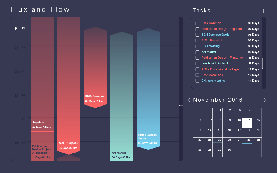
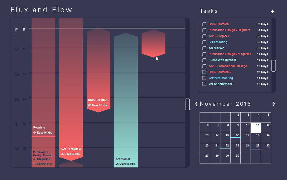
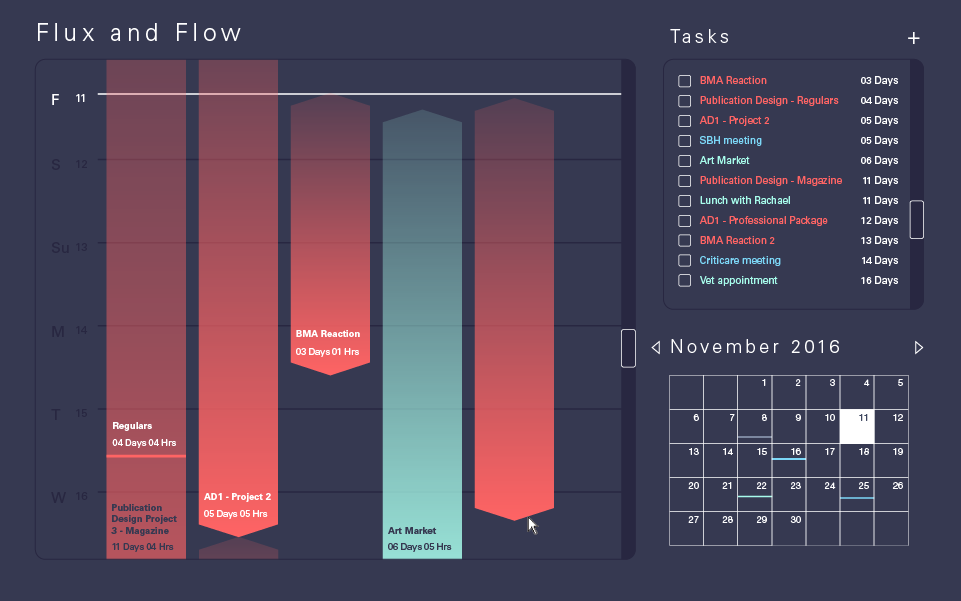
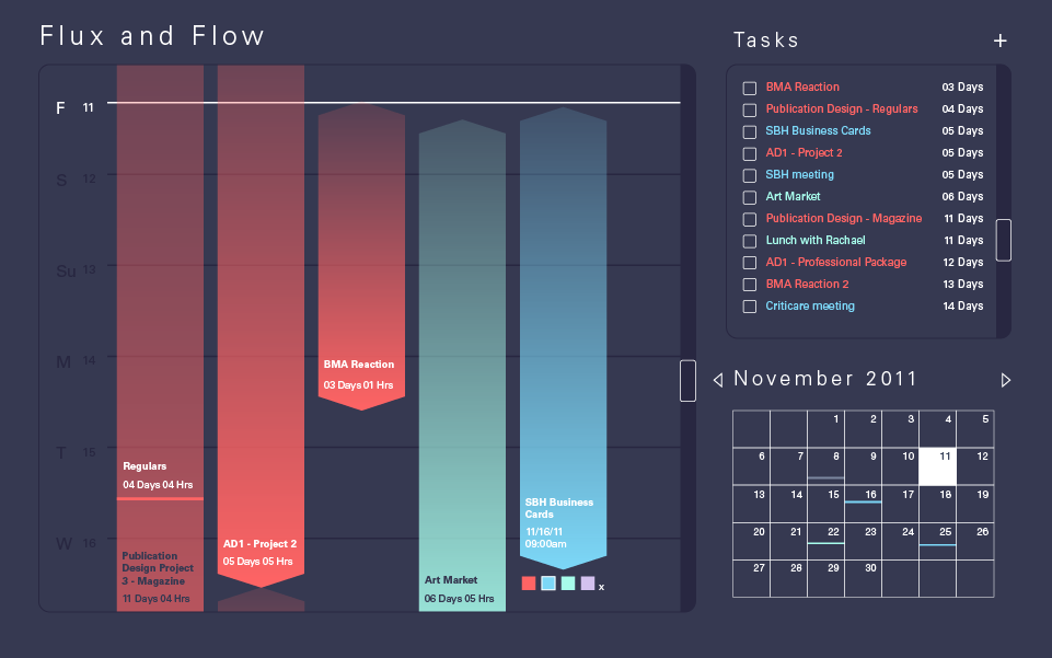
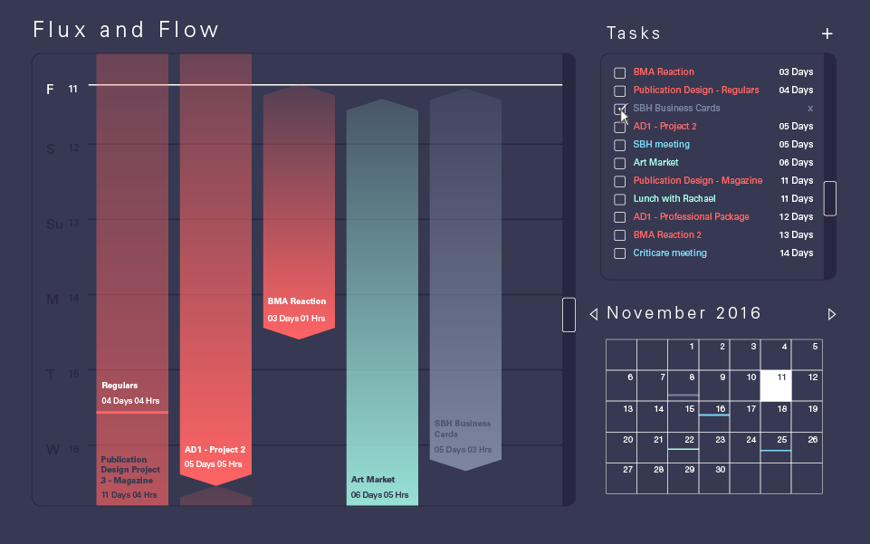
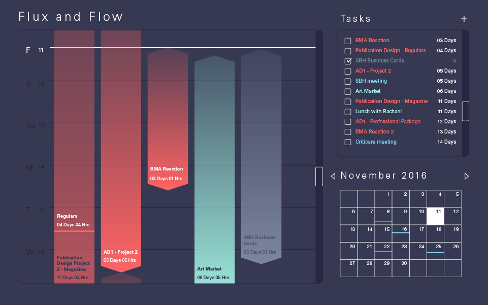
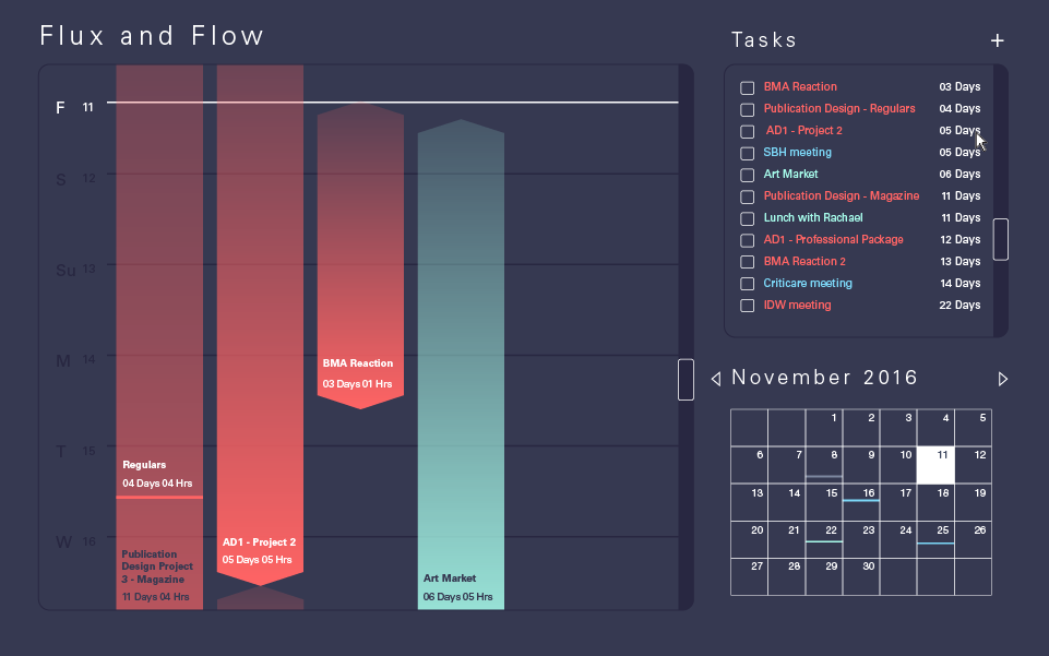
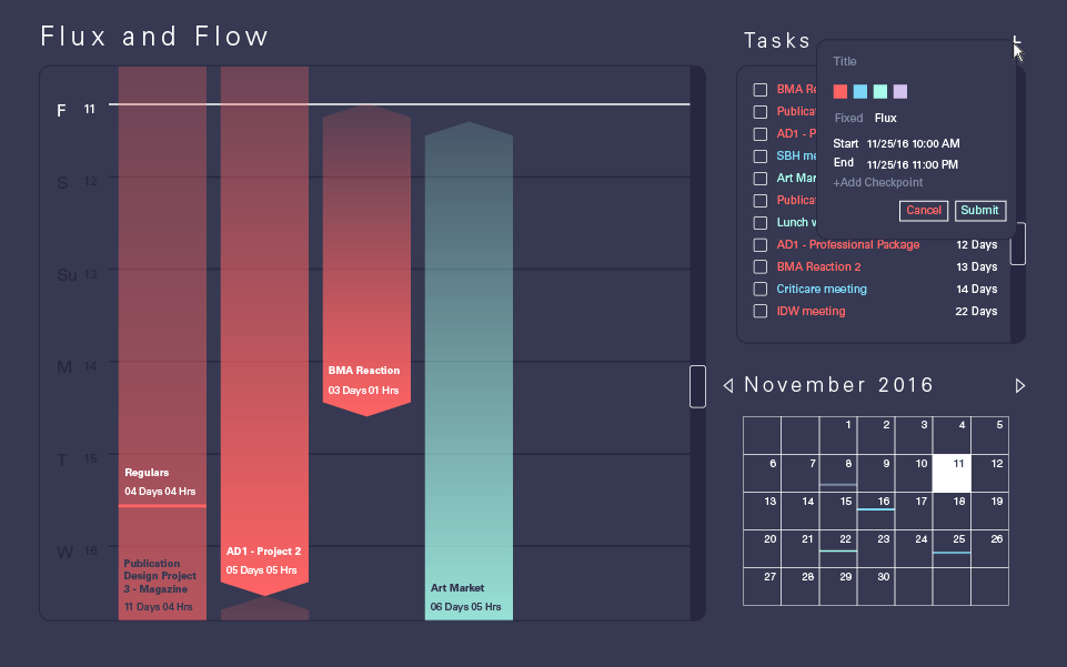
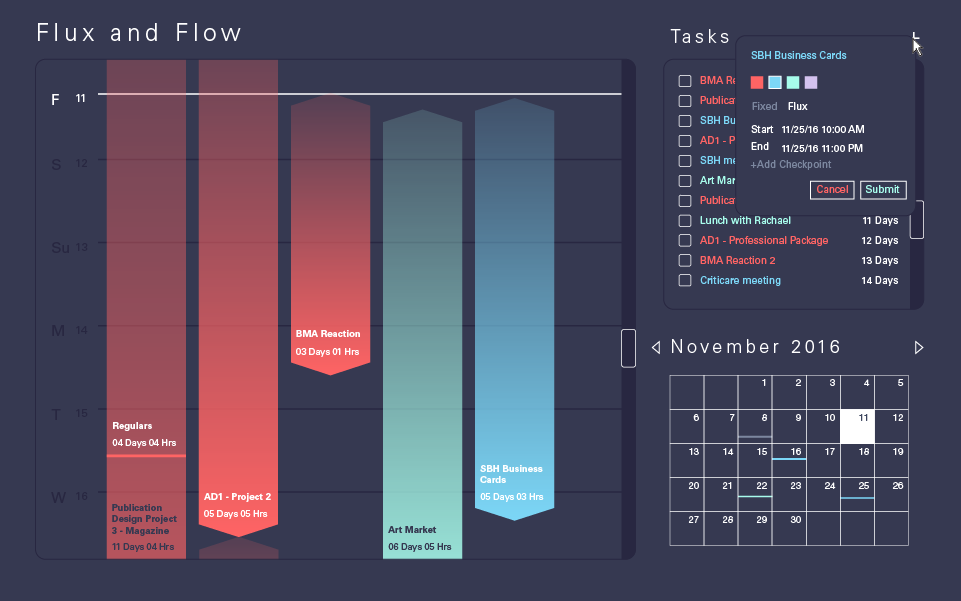
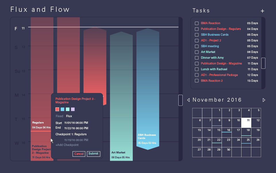
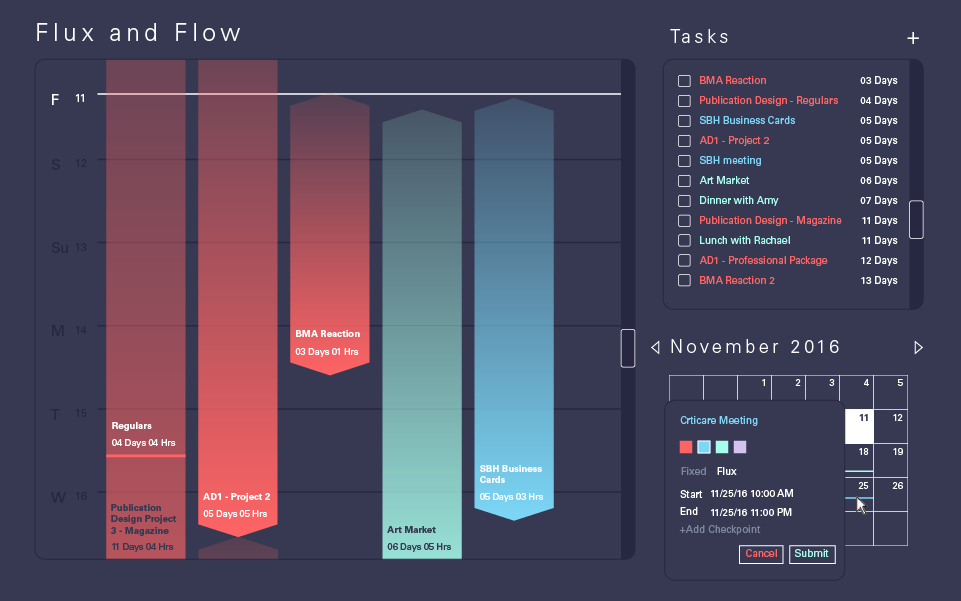
With Flux and Flow, I created a mock up for a desktop app that would allow me to list out all my upcoming appointments and deadlines in a way that made visual sense as a whole. There are two kinds of list items. Flux items happen over a span of time, like ongoing projects or long term events. Checkpoints can be added for intermittent deadlines within a long term projects, such as a first draft or proof of concept. Each flux item is visualized as a gradient. The more opaque the item is, the closer you are to the final due date.
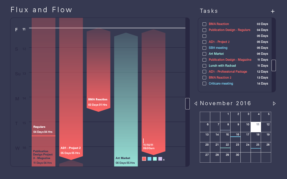
Fixed items are one time occurrences like meetings. These items serve as reminders more so than a project timeline. Every item is able to be color coded so that users can keep different calendars and get a clear visual of what their schedules look like beyond a simple calendar view.
